Explore Zhihu 2015: People, Connections and Influence, the interactive research page bringing both essays together.
Keywords: social network analysis (SNA) | statistics | power-law distribution
Introduction
To keep it readable, this piece is split into two parts. The first covers only the data and basic descriptive statistics; the second is an analysis based on the network of who follows whom.
It comes from a group project I took part in for a Social Computing course in 2015. The main language was Python, and here is the project on GitHub, dataset included (please cite this address). The project covered the whole process of crawling, storing and analysing data from the Zhihu social network. In this piece I will skip the crawling and database I/O and concentrate on sharing some interesting results. If there are gaps in the analysis, corrections are welcome, and I would be glad to discuss and work with anyone interested on some deeper analysis.
The Data
(Snark mode on.)
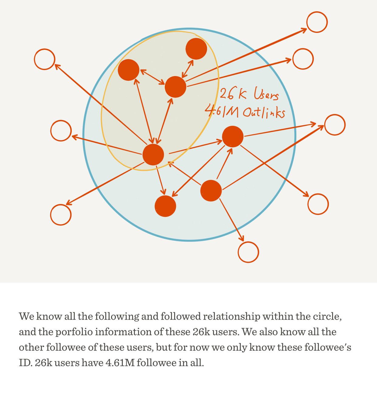
I said I wouldn't talk about the crawling, but to make clear what data we actually used, I still have to mention it briefly. In October 2015 we used my own Zhihu account (in Chinese) as the seed: first we got the data of all the users I follow, then the data of the users they follow, so counting the seed, it was a breadth-first traversal three layers deep (note that this data may well be seriously biased; after all, the seed is a goofball, and the people a goofball follows... hang on, why do I feel a chill on the back of my neck?). The user data includes each user's number of answers, the upvotes and thanks they received, the people they follow and the people who follow them, the questions they answered, and the topic tags of each question. A brief summary of the data:
- Database file: 688 MB (SQLite)
- Contents: 26,000 users, 4.61 million follow links, 720,000 questions
- A compressed archive of the data can be downloaded here (Baidu Netdisk, in Chinese).
Here is a diagram of the data as a whole:
Next I will focus on the analysis we did.
Not Playing the Same Zhihu: Mean, Median and Standard Deviation
To tell others how we are doing on Zhihu, what are the most basic measures? Following, answers, upvotes and thanks, surely. So we started by calculating the mean, median and standard deviation of each user's number of people followed (followees), number of followers, number of answers, upvotes received (agree) and thanks received. The results are in the table below:
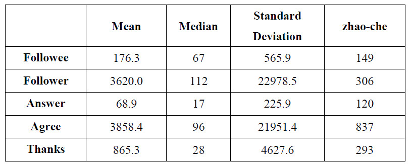
There are already plenty of interesting conclusions here.
Look at the means first. Wow, on average everyone has over three thousand followers and over three thousand upvotes. Then look at poor me, with 306 followers and 837 upvotes. And they haven't even answered many questions, yet they have all those upvotes and followers. How is anyone supposed to play Zhihu? Then look at the medians, and I feel much better at once: turns out I'm doing pretty well. I beat the median on all five measures, how nice (are you daft?).
What makes the mean and the median so far apart? Perhaps the standard deviation gives us a clue: it is huge. The standard deviations of followers and upvotes are even above twenty thousand.
What does that mean? As we know, the standard deviation measures how spread out the individual values are, and can also be read as how far most values are from the mean. So a standard deviation this large suggests that the gap between Zhihu users may be slightly larger than the whole Milky Way (kidding), and also that the vast majority of users' values are a long way from the mean: either absurdly large (like Zhang Jiawei (in Chinese)) or pitifully small (like me).
Some may object that the standard deviation depends heavily on the scale of the data and doesn't really prove the point. So let's use the coefficient of variation (standard deviation divided by the mean) for upvotes: 21951.4/3858.4 = 568.9%.
These observations also suggest a guess: the distributions of these five measures among Zhihu users are all unlikely to be normal distributions or anything close to one. Recall what the normal distribution looks like:
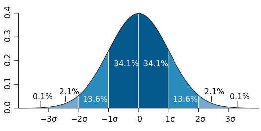
Image: M. W. Toews, via Wikimedia Commons, CC BY 2.5.

In a normal distribution, the median (the middle value), the mode (the most common value) and the mean should at least be very close, but here they are as far apart as the Earth and the Moon (how did it shrink so much all of a sudden?).
When the Snowball Stops Rolling: Long Tails and Power Laws
To test this guess further, we plotted the distribution of each of the five measures.

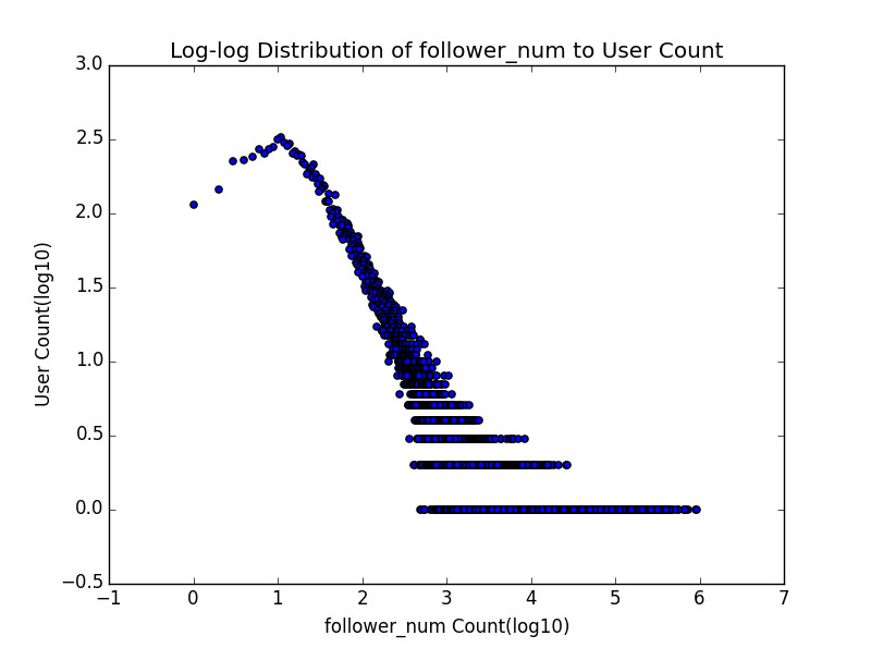
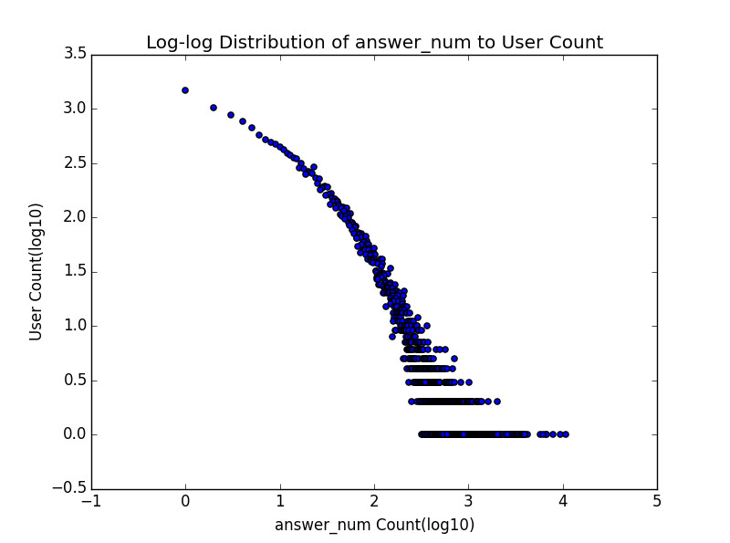
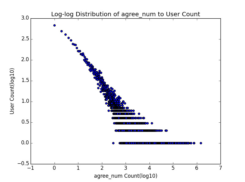
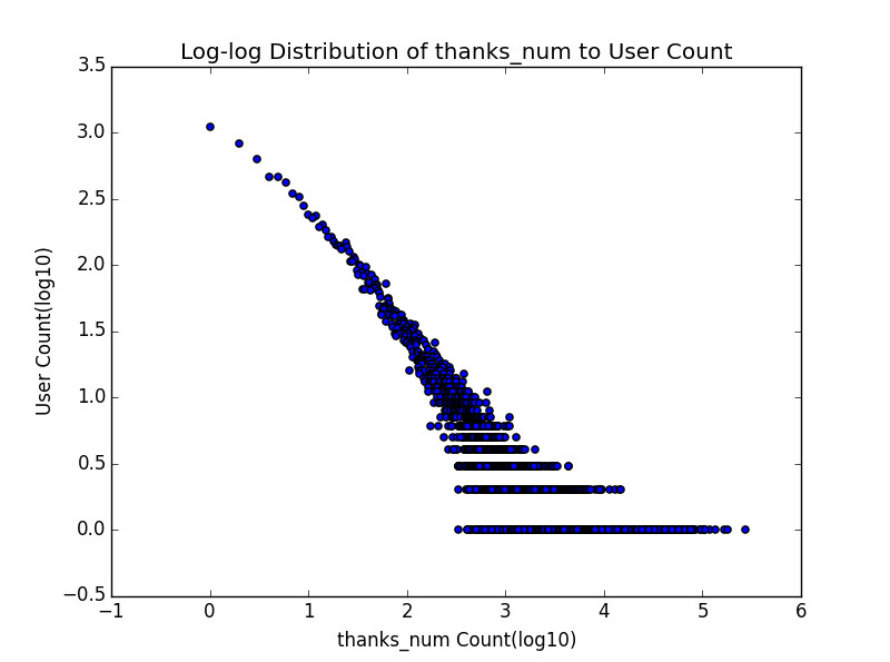
A word on what these five charts mean. The horizontal axis is the value of the measure, and the vertical axis is how many users have that value. Note that both axes are the base-10 log of the value, a common practice in research that makes the information in the chart clearer. Take the thanks chart as an example: the point at the very top left says that among these twenty-odd thousand Zhihu users, more than 10 to the power of 3, that is 1,000, people have not received a single thanks (there, there). The bottom row of points says that for users with x1, x2, ..., xn thanks (none of them small numbers), there is only one user each. Note that this row alone doesn't support any real conclusion, because there may be only one person with 100 thanks and quite a few with 101; to some extent this is probably because the dataset is small and undersampled. But taking the bottom few rows together may be more revealing.
By the way, the followee and follower charts have another name: they are the out-degree distribution and in-degree distribution of the Zhihu follow network, which will come up again in the second part.
Anyone familiar with this kind of chart will see at a glance that this is absolutely not a normal distribution, and very likely a power-law distribution (though out of laziness we did not fit one to check). This kind of distribution turns up in many networks that involve people. Also, look carefully and compare the overall shapes of the five curves. Do two of them look a little different from the other three? One is followees and the other is answers. These two curves seem to bow outward more, which means that as the horizontal value increases, the vertical value falls relatively slowly. And it just so happens that of the five measures, only these two are under the user's own control, while the other three are controlled by the crowd of other users. That is rather wonderful, and I think it could be dug into further.
Now let's take thanks as the example and draw a different kind of distribution chart. The horizontal axis is each user's index, 0, 1, 2, 3..., ordered by number of thanks, and the vertical axis is the number of thanks that user received:
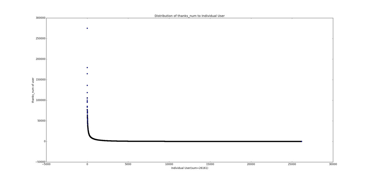
See that point shooting through the sky? Two hundred and seventy or eighty thousand thanks (this point actually appeared in the thanks distribution chart earlier too; do you recognize it, just a few paragraphs away?). Then look at the long, long tail below. Life is hard enough; let's not rub it in. Now for something even more extreme, upvotes:
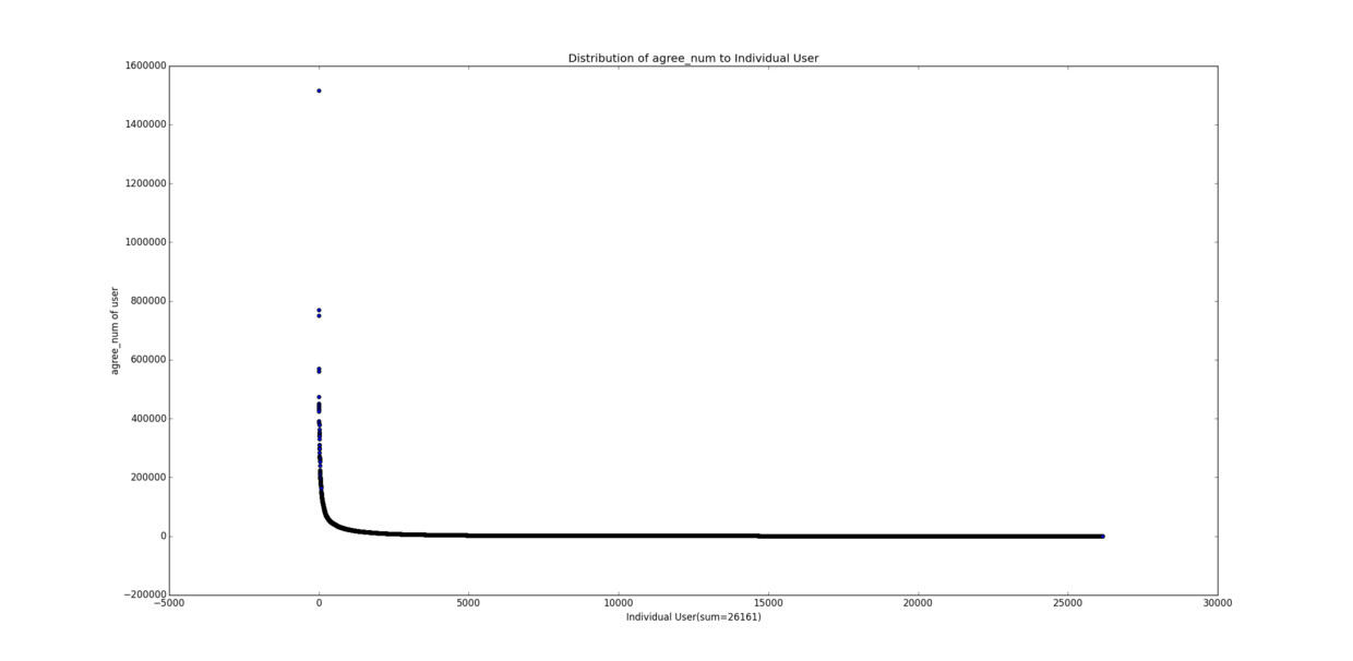
The charts for the other three measures have much the same shape.
Another Zhihu user did a similar analysis (in Chinese) with far more data than ours, and reached the same conclusion. To sum up: most people are pitifully small, while a very few are frighteningly big, not the least bit normal (or nice). Wasn't there a book that was all the rage a few years ago, The Long Tail? The long tail refers to exactly this phenomenon (with a free bonus, some of my own explanation of it: "What Is the 'Long Tail Effect'" (in Chinese)).
This inevitably brings to mind something else: the Matthew effect. The poor get poorer and the rich get richer. It feels like a dynamic explanation of the long-tail effect (I plan to look for literature on this soon). The rich control a great deal of resources and so are more likely to seize still more, while the poor are the opposite. Big-name accounts get more attention because they are famous, and so become more famous still. In a game, you carry your team and so earn more gold; with gold you buy gear and are more likely to carry again. This is classic posi(snow)tive feed(ball)back. The end result is the long-tail phenomenon.
How to Snowball into a Winner at Life: Upvotes and Followers
This section can be seen as support for the conclusion of the last one. The chart below shows two measures for each user at once, upvotes and followers:
(!Trypophobia alert!)
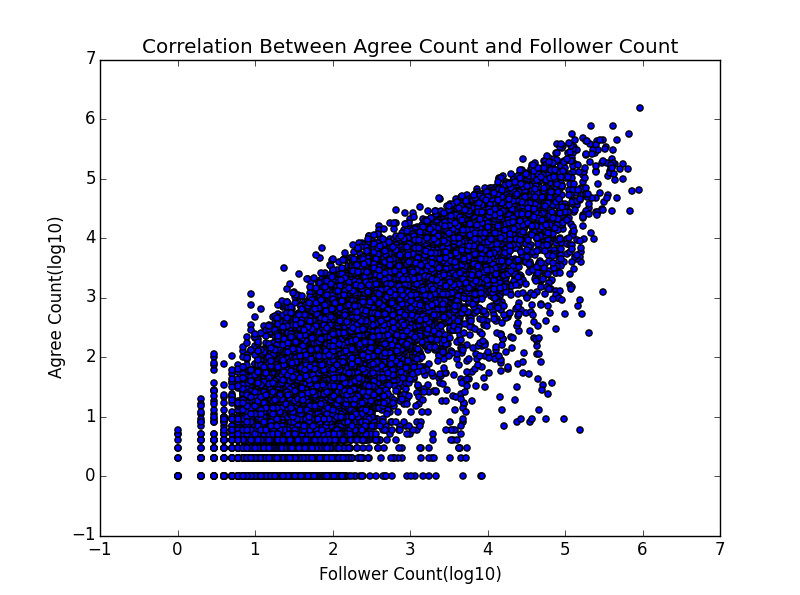
I don't think we need to run a regression or anything; it is a naked positive correlation at a glance. It also gives theoretical support to those of us wondering how to cold-start our way to becoming a Zhihu "big V" (a big-name account): either you are able to write a few answers whose upvotes shoot through the sky, or you are famous from the start and pull in followers without writing much... (all of which is utter nonsense...)
That's it for this part. If you are more interested in the network relations, don't miss the second part, which has even more in it~